Illustrated tea packaging
Retro-inspired tea box
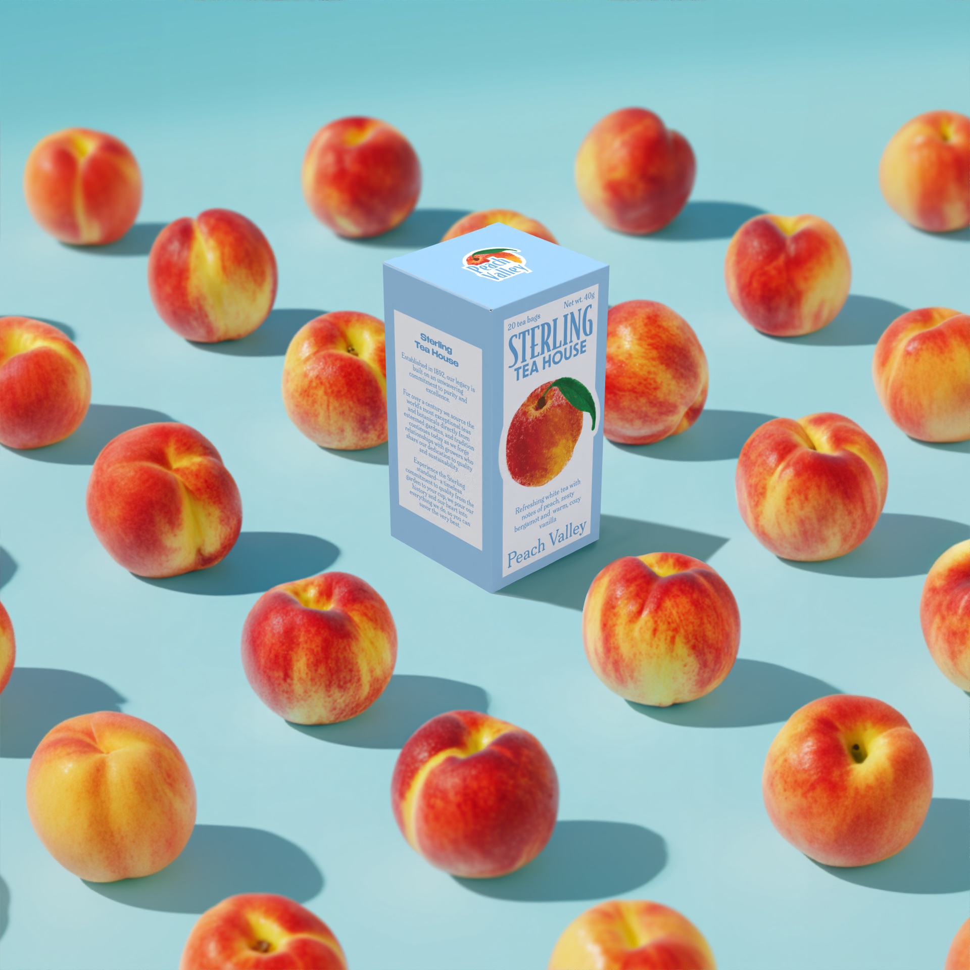
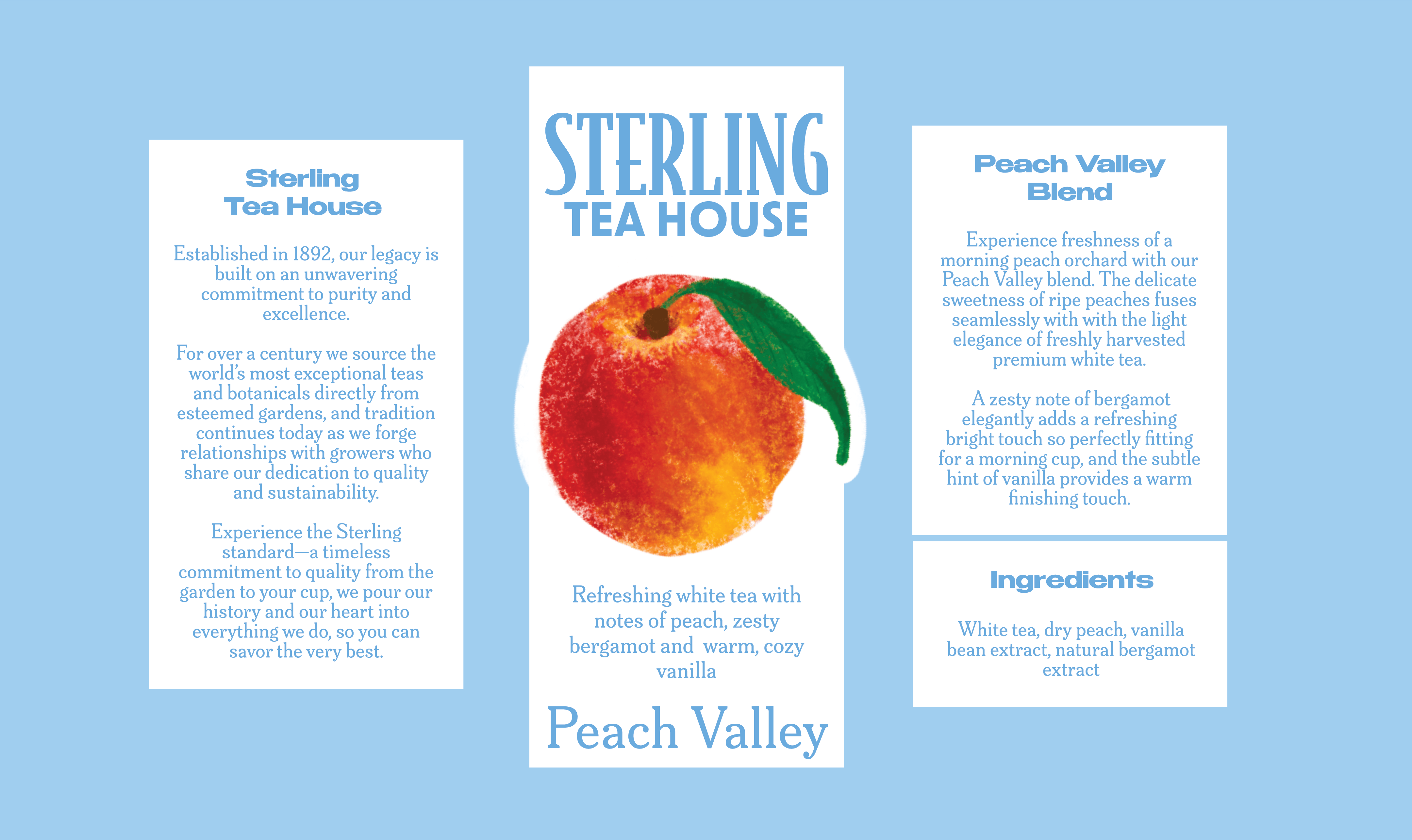
I decided to design this tea packaging as a creative challenge—to push beyond digital design and explore tangible, playful aesthetics that I don’t often see in utilitarian design. I wanted to bring bold color and unexpected energy to a product often associated with tradition, making it feel fresh, inviting, inspiring to feel happy.
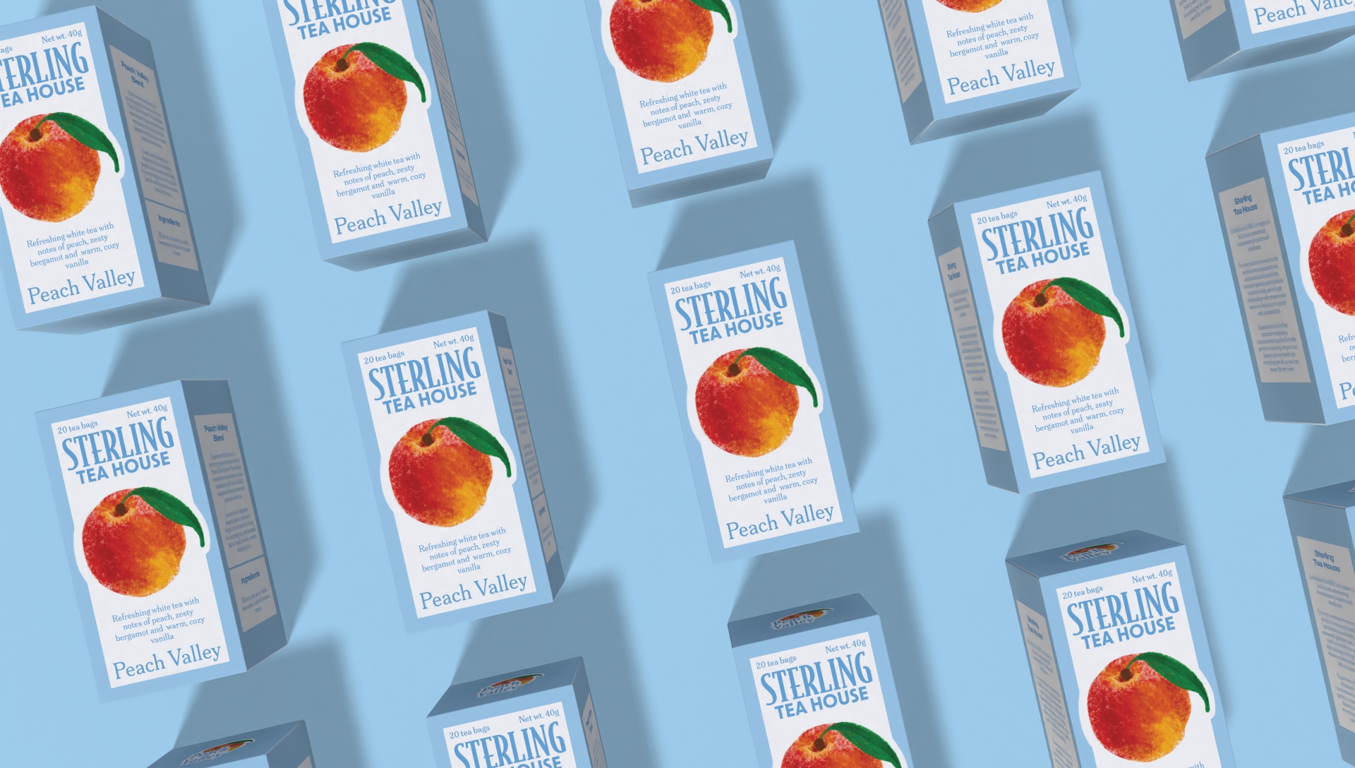
This project was a chance to experiment with textures, typography, and illustration in a way that could make everyday rituals (such as brewing tea) feel more joyful, and the experience itself start with looking at the box. By blending vibrant hues with sleek functionality, I intended to prove that packaging can be both visually striking and user-friendly. Ultimately, it was about reimagining how small details, like a tea box, can spark delight in mundane moments. Oh, and the name, of course, is inspired by one and only Archer.
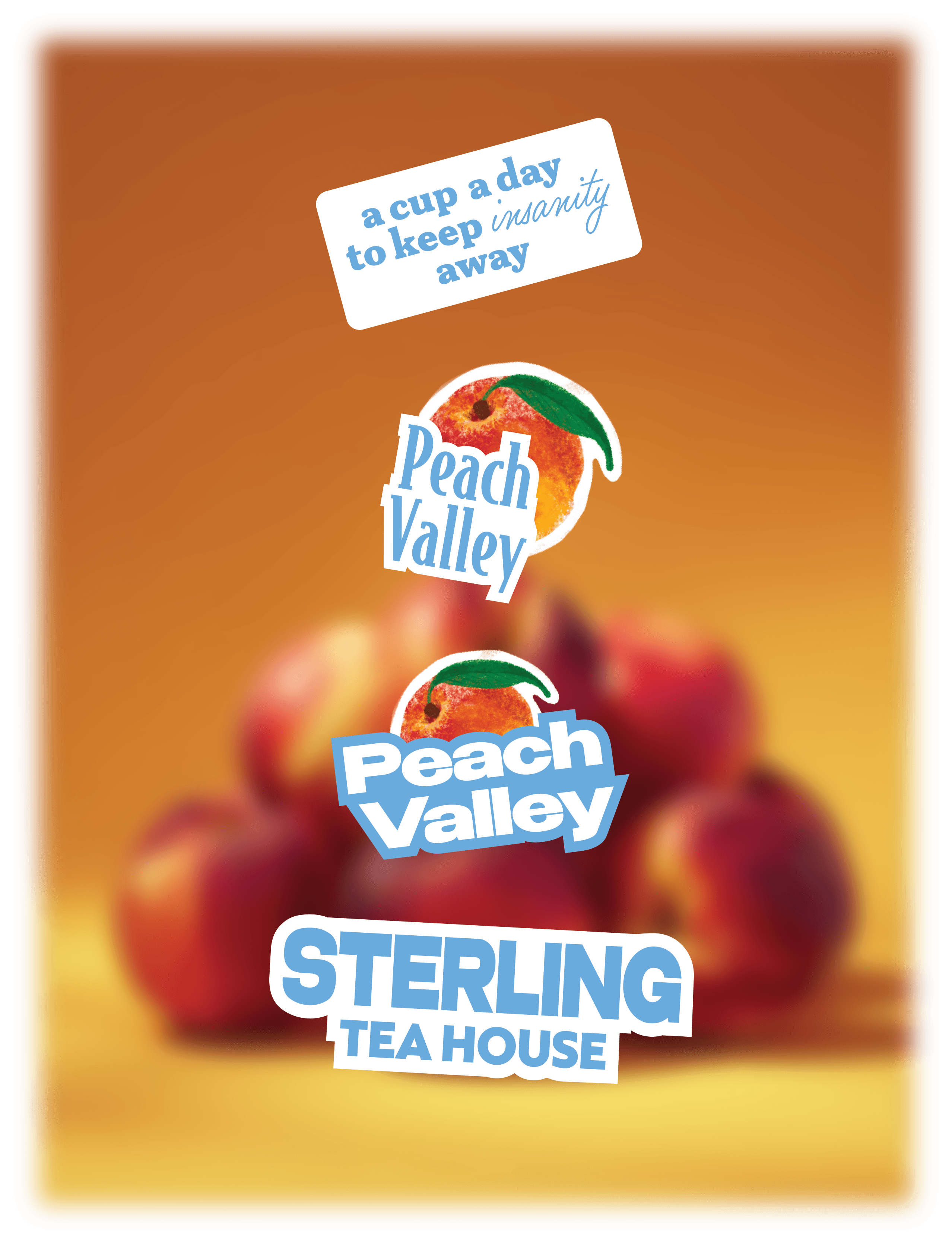
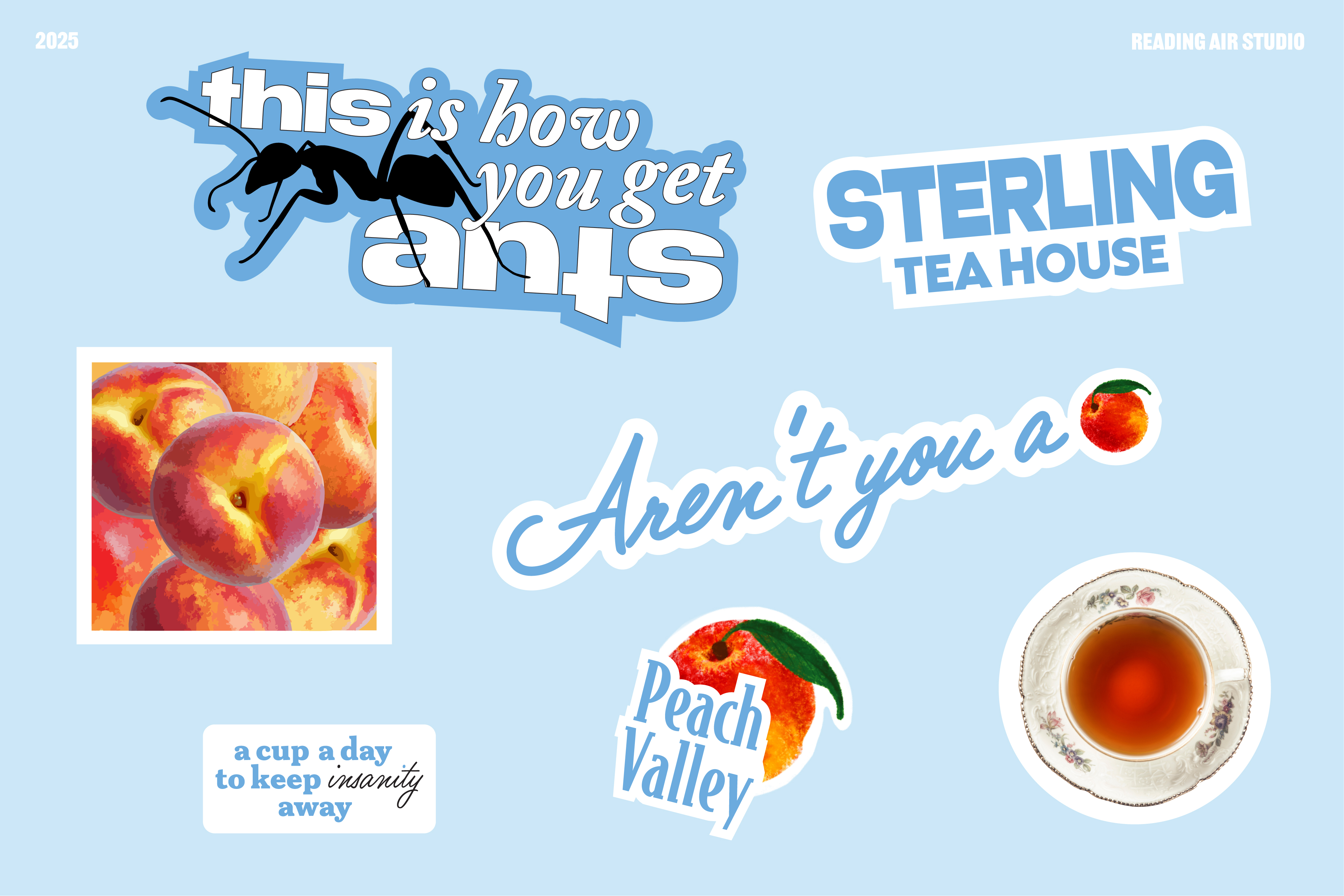
Sticker set is a must - to add a personal touch and integrate the brand further into the customer's lifestyle.