
My role:
Creation
Maintenance
Testing
Validation
Tools:
Adobe Illustrator
Figma/Sketch
Zeroheight
Before the major icon style update in early 2023, Cathay Pacific's web design ecosystem didn't have a unified icon style. We used various icons mismatched in style, stroke weight, and overall look.
At the same time, overall branding was updated to what you can witness at cathaypacific.com, and the older icons didn't match this new sleek high end style.
Brand misalignment:
Inconsistent user experience:
Lack of scalability:
Uncertain market positioning:
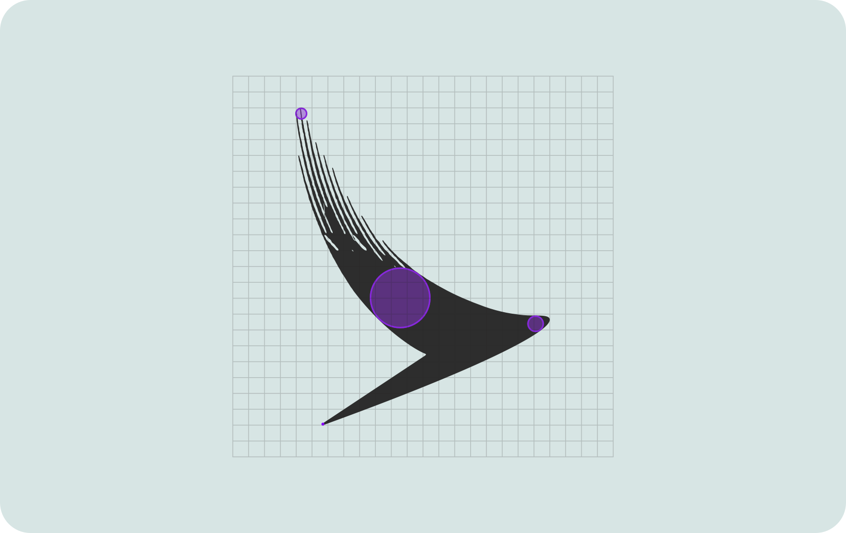
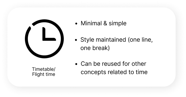
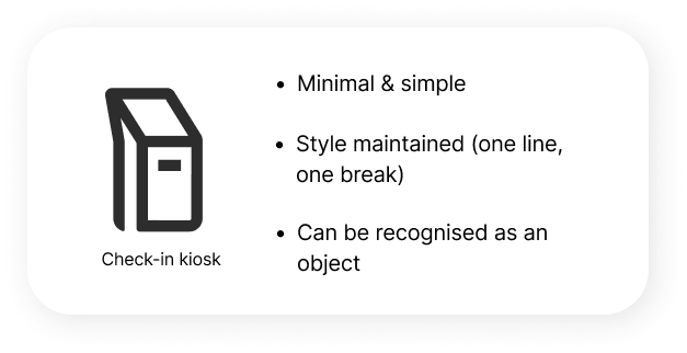
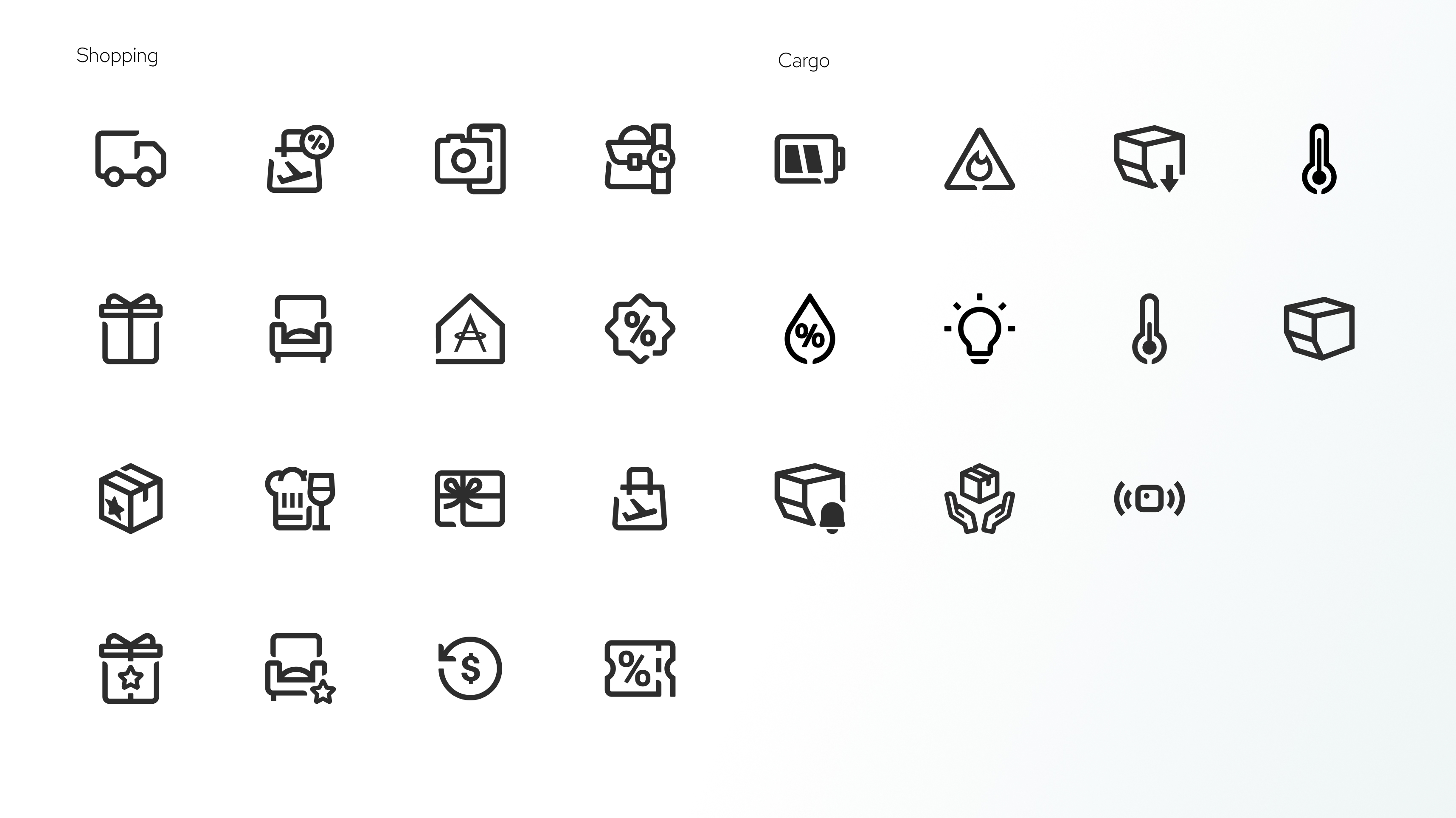
Inspired by our iconic logo, the brushwing, the new style incorporates different line widths and textures created by adjusting the pressure used while painting with a brush.
To mimic the changes in brush pressure, apply different degrees of rounded corners at the start of the line.
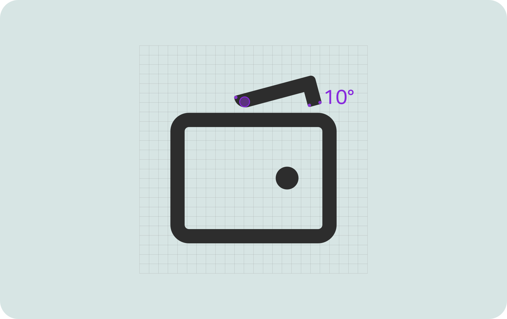
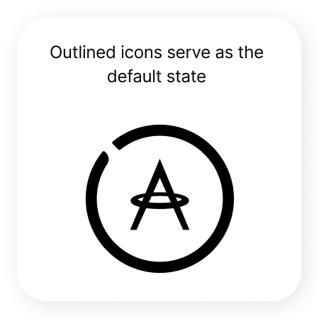
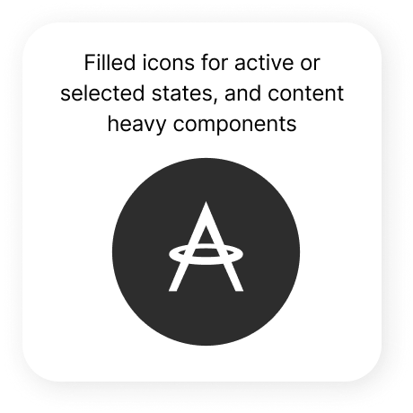
Stroke weight thickness allows only a minimalist style:
instead of relying on realistic interpretation the designs have to be simplified and/or abstract yet still recognisable enough while maintaining style integrity (line break)
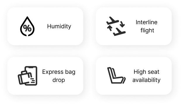
Depicting specific aviation-related terms and concepts requires advanced thinking to translate something that doesn’t have a physical form to an understandable for a general user visual concept.
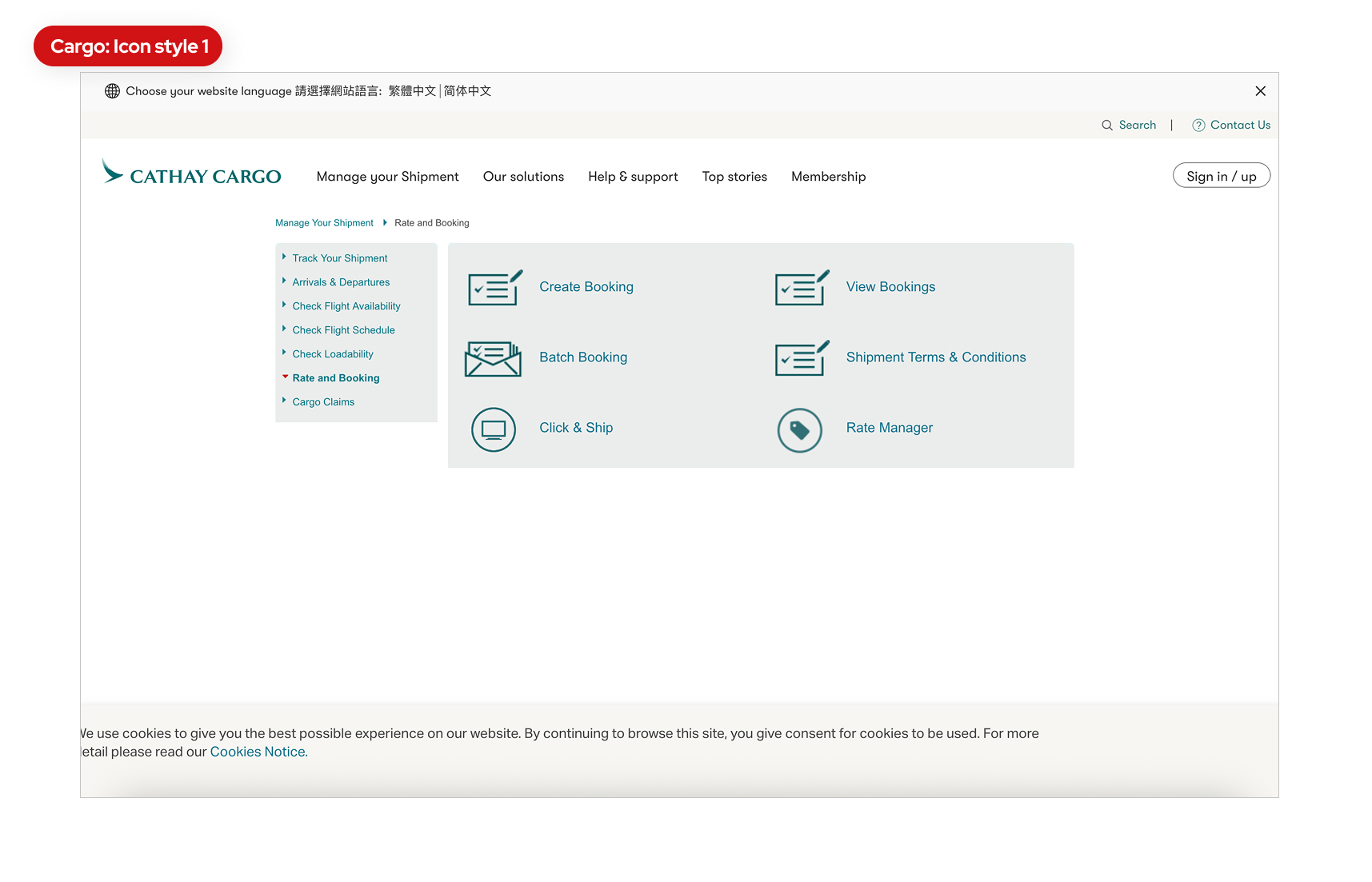
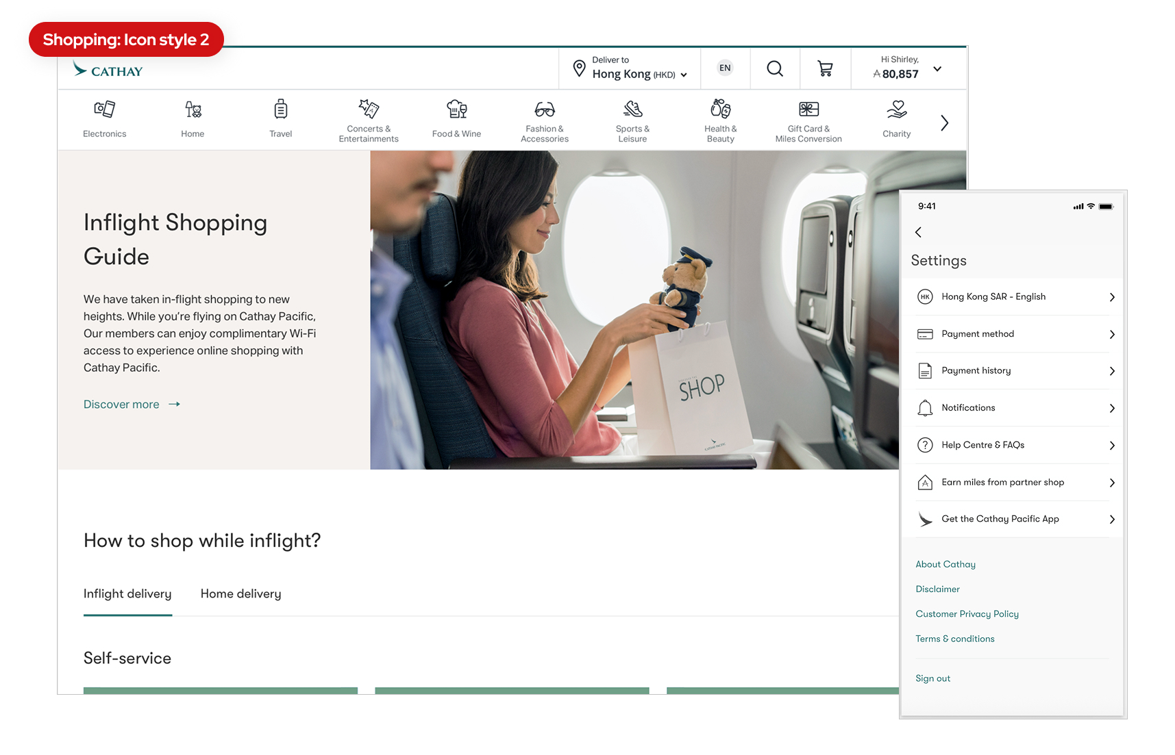
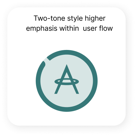
Visually consistent style that sets CX brand apart with its distinct minimalist look that seamlessly integrates into our digital experience.
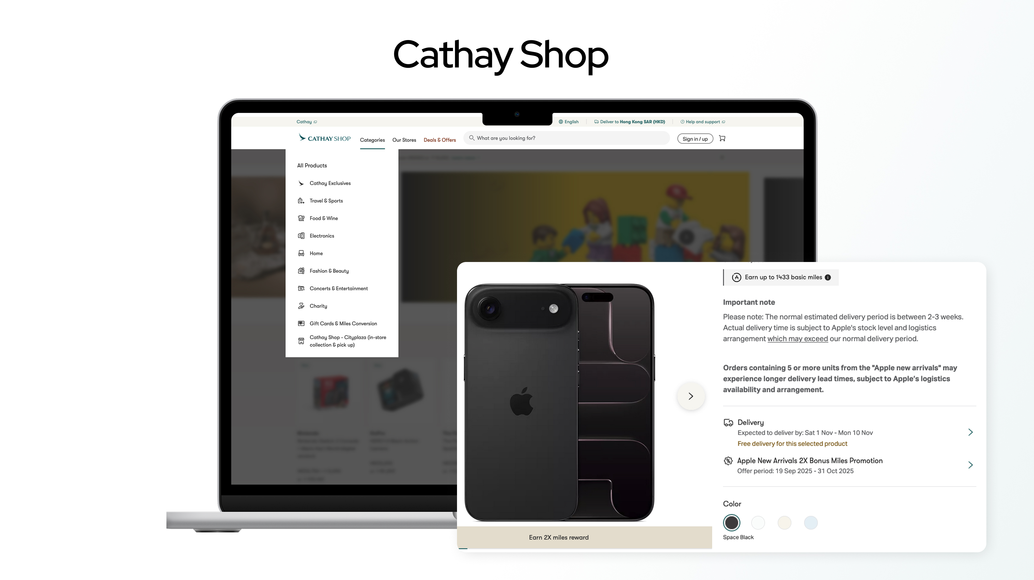
Comprehensive set of icons covering many needs of multiple CX digital products (B2B - cargo, lifestyle, travel, shopping, insurance).
.jpg)
.jpg)
.jpg)
.jpg)

You will remember how it made you feel